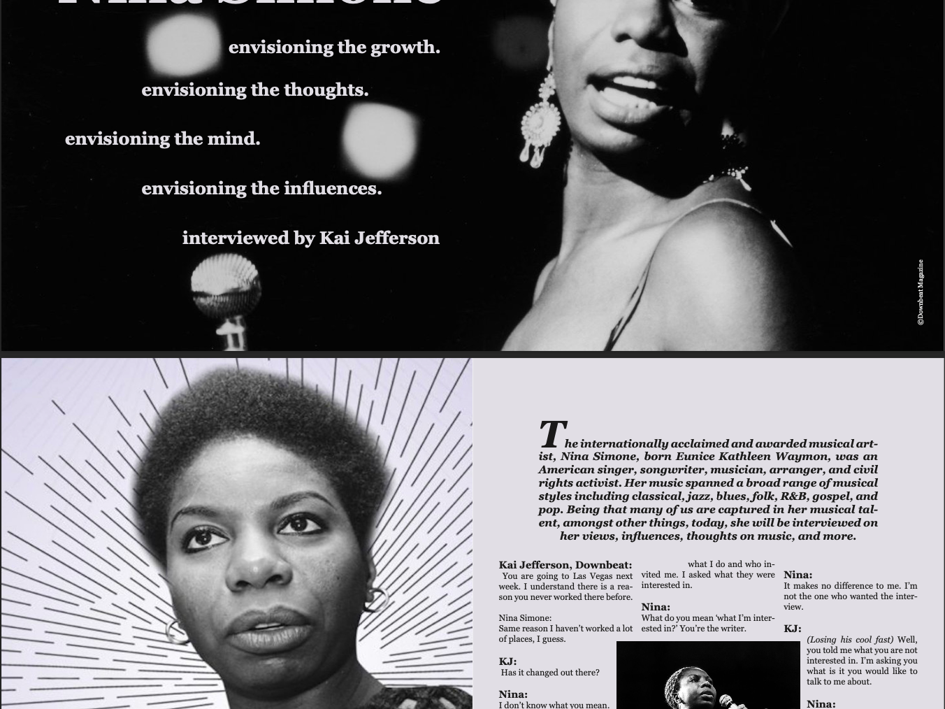
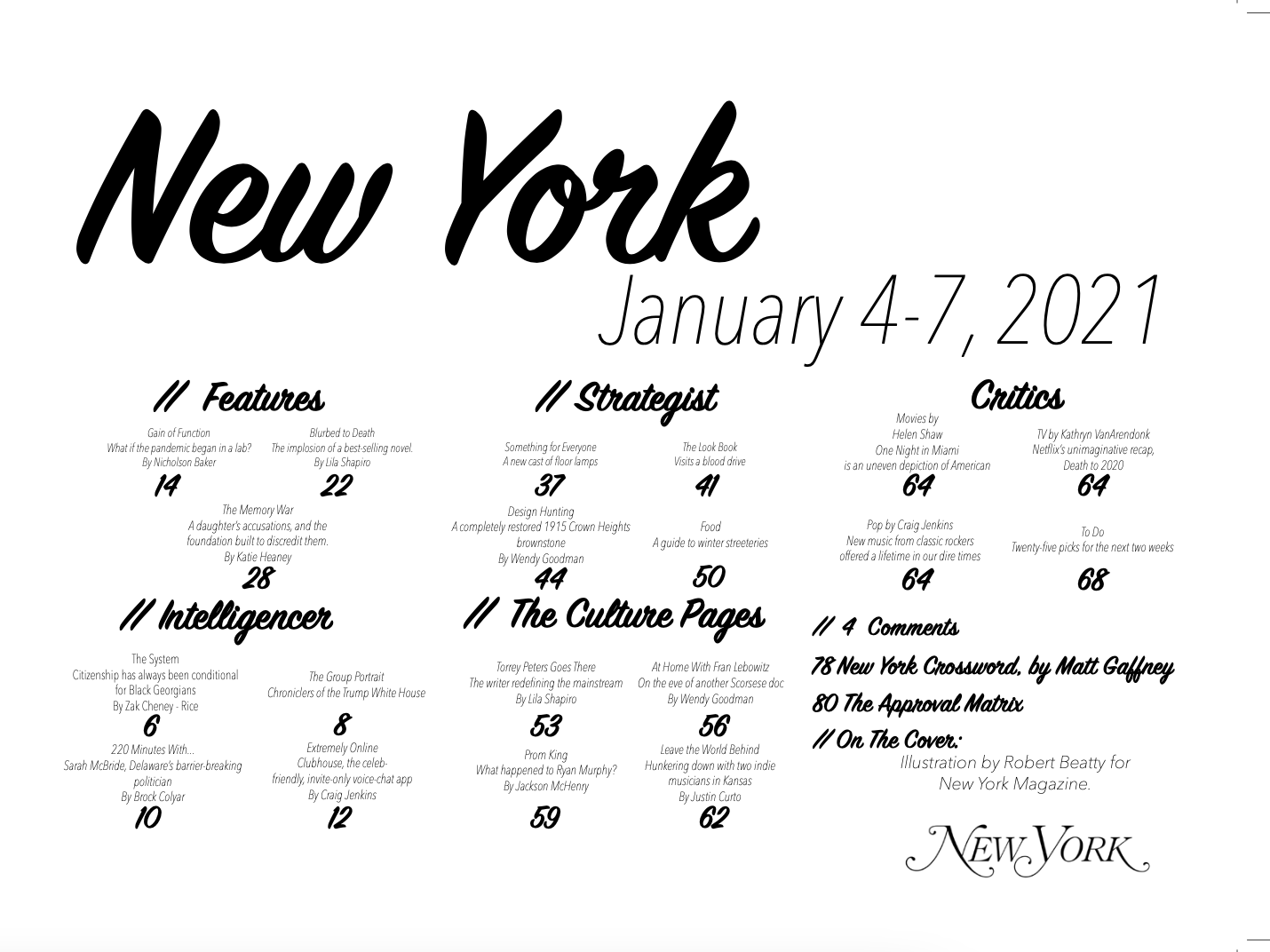
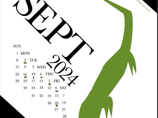
A few excerpts from a magazine made in my Electronic Design 2 class, which was created to appeal to young New Yorkers. My execution for this project was rooted in a conventional style that was easy on the eyes. I wanted to bring out the best of New York within the mock magazine by using hierarchy not only with a Helvetica type (synonymous with NYC Transit), but imagery, as well . One will notice the intricate placements of images within articles and cover pages throughout, which help readers to understand what they were reading.


